Building a Collectible-Driven E-Commerce Experience for India's Growing Anime Market

A hassle-free and secure way of buying your favourite anime figurines and merchandise online

Otaku Haven Store app on a phone, showing a grid of anime figurines, with Naruto and Goku figurines in the background

Category

Category

Anime

Industry

Industry

Retail E-commerce

Project Type

Project Type

Concept Project

Project Overview

Otaku Haven Store is an e-commerce app that provides a platform for anime lovers interested in buying anime-related products such as merchandise, figurines, accessories, etc.

Results

This is a concept project, so it never shipped. I tested the prototype with 8 people in short guerrilla sessions. Seven of them found a figurine and placed an order on their own, and the average time to do that fell from 5 minutes in existing anime store apps to 3 minutes in the prototype.

8

People in guerrilla usability tests

7 of 8

Placed an order without help

3 min

Average time to order, down from 5 min in similar apps

Problems with Legacy Apps

Lack of Visual Hierarchy

Annotated New Pre-Order Figures screen from an existing anime store app. Callouts: 1. Poor text alignment adds cognitive load. 2. Cards of different sizes make the page hard to skim. 3. The original price is almost invisible and fails WCAG contrast. 4. There is no spacing between the product cards. 5. Almost every product is labelled Premium, which defeats the scarcity principle.

Lack of Visual Hierarchy

Complex Navigation

Annotated category screen from an existing anime store app. Callouts: 1. There is no search bar, which makes products hard to find. 2. Low quality images give a poor first impression. 3. Showing the total number of items next to each category name adds nothing. 4. The tab name Random tells the user nothing. 5. The chevron is too small and may cause misclicks.

Lack of Visual Hierarchy

Cluttered Homepage
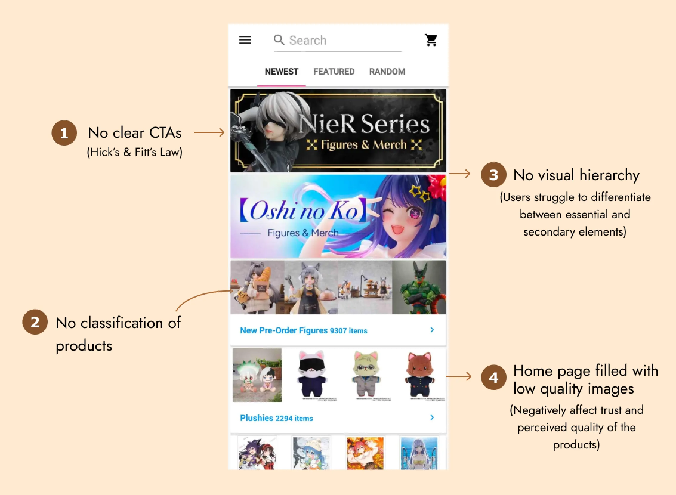
Annotated home screen from an existing anime store app. Callouts: 1. There are no clear calls to action (Hick's and Fitts's laws). 2. Products are not classified. 3. There is no visual hierarchy, so users struggle to tell essential elements from secondary ones. 4. The home page is filled with low quality images, which hurts trust and the perceived quality of the products.

Lack of Visual Hierarchy

Problem Discovery
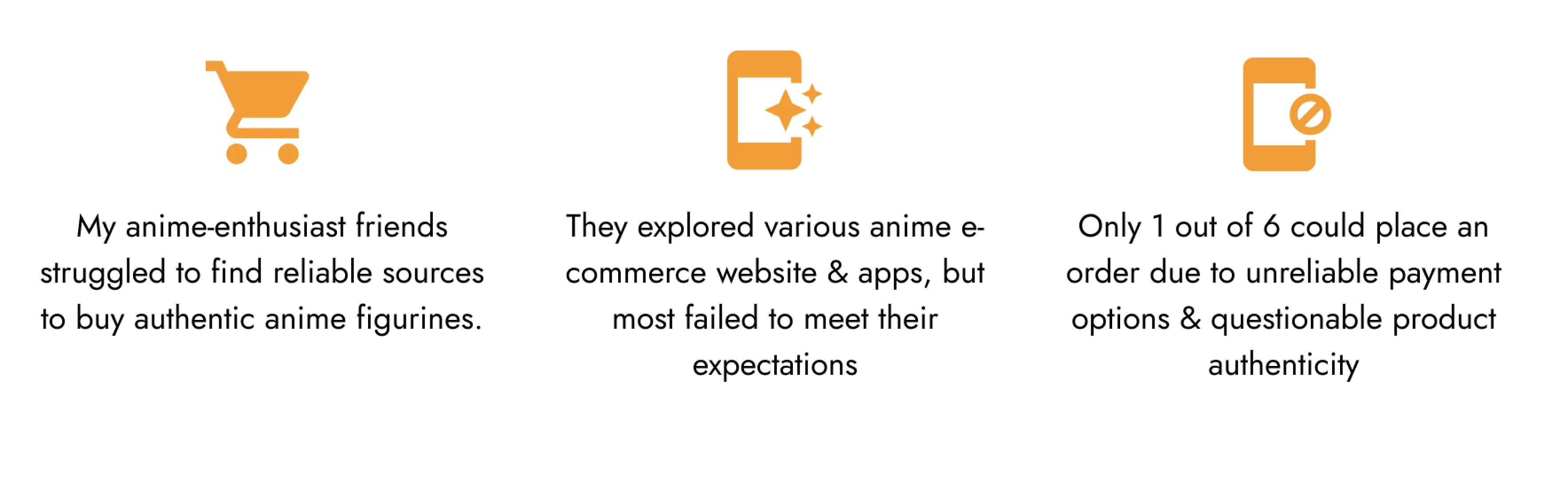
Three findings: My anime enthusiast friends struggled to find reliable sources to buy authentic anime figurines. They explored various anime e-commerce websites and apps, but most failed to meet their expectations. Only 1 out of 6 could place an order, because of unreliable payment options and questionable product authenticity.

Problem Statement

Problem statement: How can we design an anime e-commerce app with an intuitive UI that users love to use and that also boosts the conversion rate for the business?

Goals

User goals: 1. Design user-friendly features with intuitive navigation that encourage exploration and engagement, and provide a delightful experience. 2. Implement visual hierarchy to guide users' attention to key elements and actions. Business goals: 1. Place trending products, promotions, limited-time offers and CTAs strategically to drive conversions. 2. Incorporate rewards for regular app shoppers to encourage repeat usage. 3. Allow a habit-building, fast payment experience for shoppers while strengthening product discovery in the app.

Target Audience

People who watch and follow anime (usually aged between 15–35 years) and want to order merchandise and other related stuff online.

User Persona

User persona: Tanishka Singh, 22, software engineer, Bengaluru. Quote: I am tired of using these apps. I just want an app that allows me to order authentic products online, securely. User goals: 1. Accurate information about the authenticity of anime figurines. 2. A smooth checkout for a hassle-free shopping experience. 3. Intuitive navigation that makes products easy to search. 4. Detailed information about the materials and dimensions of the figurines. Pain points: 1. I wish the app had better search filters to help me find the exact figurine I'm looking for. 2. The app should offer multiple payment options; I couldn't place the order because I don't have a credit card. 3. Many products don't have a detailed description. 4. Not sure about the authenticity of the figurines.

Design process and challenges

A person holding a phone showing the Otaku Haven Store figurines screen, framed by the phrases authentic products, user-friendly app, seamless checkout, secure payments, superfast delivery and exclusive limited edition products.

After analyzing different apps such as KiayaxAnime and TOM Shop I noticed a common pattern of poor user experience.

I created multiple iterations of each flow and prototyped them to evaluate their performance and identify the most effective iteration.

Clearly defined product categories

Two iterations of the Categories screen. Iteration 1, the final design, is a grid of large category images, which makes it easy to see many categories at a glance and suits visually oriented users. Iteration 2 is a list with small icons, which might not be visually engaging enough for an anime store where visual appeal is key.

Quick access at the tip of your thumb 👍 - Navigation Bar

 For mobile apps, screen real estate is limited and a navigation bar provides convenient access without having to dig through menus.

Bottom tab bar with Map, Shops, Favorites, History and Profile, with Shops selected. Annotations: the tab bar is within easy reach of the thumb and shows the main sections of the app, and the color-filled icon shows which section is selected.

Hamburger Menu - The hidden treasure of features

It is ideal for secondary navigation elements that users do not need immediate access to but still need to be available.

Hamburger menu in three states: the Categories screen; the menu open, listing Profile, Stores, Track Order, Locate on Map, Notifications, Settings and Logout; and the same menu with Track Order highlighted.

Detailed product description in one place

 I have focused on the price and add-to-bag button as these two are the key details and CTA user looks for while shopping.

Two iterations of the product screen for a Dragon Ball Legends figurine priced at $28. Iteration 1 puts everything inside a card, which looks cohesive but wastes space. Iteration 2, the final design, uses a bigger photo so users can see finer details, and makes better use of the limited screen space.

Quick product discovery

The filter pills at the top help both users and businesses. Users can easily filter the products they are looking for, and companies can suggest custom filters based on users' search and shopping history, eventually increasing the conversion rate and revenue.
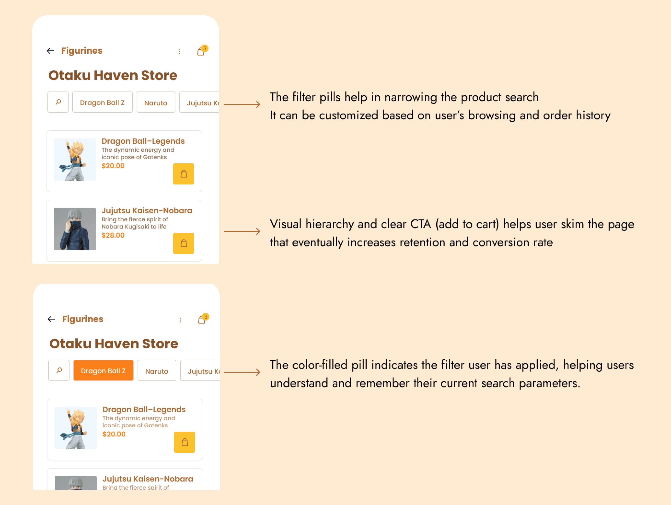
Figurines screen with filter pills for Dragon Ball Z, Naruto and Jujutsu Kaisen above product cards, each with a price and an add to cart button. Annotations: the filter pills narrow the search and can be customized from browsing and order history; the clear hierarchy and add to cart button help users skim the page; a color-filled pill shows which filter is applied.

📍Locate your favorite anime store near you

For all the users who like to touch and feel the product before making a purchase, I have included a curated list of physical anime stores across major cities in the app.

Stores nearby map and a store page. Small pins mark physical anime stores in the area, and a bigger orange pin marks the selected store, Bobble Street Store, with its opening hours, address and photo. The store page shows a photo of the storefront, a short description, ratings, a Browse the store button and popular products.

Meet Your Inner Otaku (Profile)

Profile screen. Annotations: 1. A small user icon puts functionality ahead of identity. 2. Otaku Coins, a balance of 12,500 next to a Premium badge, reward engagement. 3. Recently purchased items give quick access to order history. 4. Recently viewed items encourage more browsing.

Otaku Coins - Incentive for engagement & Gamification 

Otaku Coins are a reward for purchases, encouraging users to shop more to accumulate coins, a classic gamification strategy.

Recently viewed items increase engagement

Prompts users to continue exploring the app by revisiting items they previously liked, which can lead to further browsing and potential purchases.

Usability Testing

I did guerrilla testing with real users to validate the designs or test prototypes.

I ran guerrilla usability tests with 8 people. On average they took 3 minutes to find a product and order it in the prototype, compared with 5 minutes in similar apps on the market.

Seven of the 8 participants (87.5%) searched for their favorite product and placed an order on their own.

Failures & Learnings 💡

Failures and learnings: 1. Changed the order of the bottom tab bar after feedback from user testing, from Map, Shops, Favorites, History, Profile to Home, Shops, Favorites, Bag, Profile. 2. Chose a more saturated button color because the earlier color failed WCAG accessibility guidelines. 3. A successful design balances user needs with business objectives, so design choices should be data-driven and aligned with both. 4. Regular user testing and feedback catch issues early and support iterative improvements, so users should be involved throughout the design process.